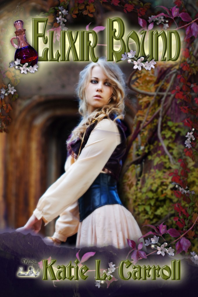
I originally wrote this post back when I did the blog tour for my YA fantasy ELIXIR BOUND. I don’t think I’ve ever posted it on my blog, and I thought it would be fun to highlight the cover process of my book during the January #InkRipples theme of book covers.
 I was lucky enough as a MuseItUp author to have a little input (mostly in the form of an author questionnaire) when it came to the cover of ELIXIR BOUND. That’s not to say that I can take any credit for how gorgeous it is. All that credit goes to my cover artist C.K. Volnek.
The beauty of what she did was to take some of my thoughts on what types of covers I like (I happened to cite the American cover for Melina Marchetta’s Froi of the Exiles as one that caught my eye of late) and a few key elements of the story and integrate them into an engrossing and detailed cover that in no way looks crowded or busy. If I knew how she was specifically able to do this, I would probably quit writing and become a cover artist myself (not really, I would never quit writing).
What I can tell you are some of the details I gave her and how they showed up in the cover. (I’ll be honest, this post is really just an excuse to let me point out all the cool things on the cover!) ELIXIR BOUND is essentially about Katora’s quest to retrieve the main ingredient to her family’s secret healing Elixir so she can take over as guardian.
Let’s start with character. Katora is definitely the central element on the cover. I expected to be asked about how she looks, but what I didn’t expect was to be asked about her personality. The three words I chose to describe her: stubborn, confident, independent. I think the model depicting Katora was a great fit. Her expression and body language were just right. So character: check!
Let’s move onto plot. The subject of the quest is the Elixir, which is prominently represented in the left-hand corner near the title. The objective of the quest is to find the Elixir’s main ingredient, which just happens to come from the tiny white flowers vining their way along the edges. So plot: check!
Next let’s discuss setting. Most of the journey takes places in a forest. The background gives you a sense of the rustic setting with the tree to the right and the mysterious doorway-type thing behind Katora (is it a cave, the entrance to a tomb?). I like how it sets a mood, but doesn’t get too specific because when I read, I like to let my own imagination fill in those details. Have you noticed the mountain range at the bottom of the cover? Did you notice its shape? The mountain range is aptly called The Sleeping Giant and I was so thrilled to see it included on the cover. So setting: double check!
And finally, my favorite aspect of the cover…my name, of course! It’s been my dream for so many years to see my name on the cover of a book and I couldn’t be more pleased with the result.
#InkRipples is a monthly meme created by Katie L. Carroll, Mary Waibel, and Kai Strand. We pick a topic (January is all about book covers), drop a ripple in the inkwell (i.e. write about it on our blogs), and see where the conversation goes. We’d love to have you join in the conversation on your own blogs or on your social media page. Full details and each month’s topic can be found on my #InkRipples page.

![Image[2]](https://katielcarroll.com/wp-content/uploads/2013/11/Image2.jpg) Katora, from my YA fantasy
Katora, from my YA fantasy 


