Welcome to #InkRipples 2017! It looks like it’s going to be a big year for #InkRipples with lots of new bloggers joining Kai Strand, Mary Waibel, and me (Katie L. Carroll) in our monthly meme. We’re starting off the year by talking about book covers.
The rise of online shopping and ebooks have changed the way I view a book cover. It’s a much less tactile experience than it used to be. Often my first exposure to a book is a small picture of the cover on a screen. Any kind of texture it might have is not evident, and the small details are hard to discern.
This creates a new challenge for cover designers. How do you simultaneously create a cover that pops on a bookshelf and stands out in a small picture on a screen? Well, I’m no cover designer, so that’s not a question I can answer. I can, however, share some of my favorite book covers and why I like them.
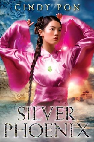 The hardcover of Cindy Pon’s YA fantasy SILVER PHOENIX immediately grabbed my attention the first time I saw it. The colors are bold and gorgeous (something about the combo of the pink and blue hit all the right aesthetics for me), and the yellow/gold color in the background makes it looks like the cover is glowing. I get a strong sense of character from the cover model and hints of the fantasy world I’m about to delve into.
 Another favorite YA fantasy cover is Melina Marchetta’s FROI OF THE EXILES. The colors are subtle, but, again, the use of color to convey light is so effective in catching my eye. The somber expression of the cover model and the sword hilt in layered in front of his face give it a dangerous feel, and the mountains at the bottom provide a sense of mystery. Looking at these two first examples, I’m noticing they both have clouds and a sunset (sunrise?) in them. Not sure what to make of that similarity, but felt worth pointing out.
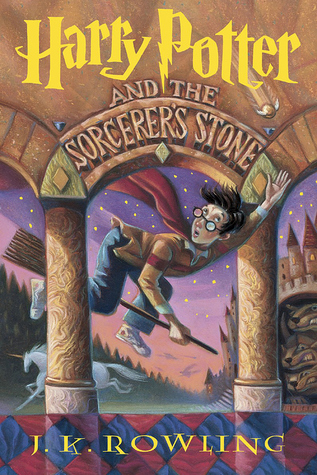 I have the Harry Potter books in the British and U.S. versions, but for me, nothing tops the covers of the U.S. hardcover editions. The illustrations of Mary GrandPré are superb. It’s hard to pick a favorite (maybe Half-Blood Prince), but the first book serves as a beautiful example of a magical middle grade cover. The movement of Harry, the sense of wonder every detail evokes, the magical elements to it, the iconic font of Harry’s name…I could go on, but let’s just say these covers are among my all-time favorites.
 So many of my favorite covers are fantasy ones, but I wanted to include something more contemporary. Nova Ren Suma’s IMAGINARY GIRLS has fantastical elements to it but is also deeply rooted in a more contemporary world. The calmness of the girl underwater creates so much drama and intrigue. Is she drowning? If she is, why is she so calm? And again, it comes back to color. The tranquil blue juxtaposed by the pop of red ribbon, and the utter paleness of the girl. Well, this cover totally made me want to read the book!
What aspects of a book cover grab your attention? What are some of your favorite book covers? Next week, I’ll be posting about how the cover of my YA fantasy ELIXIR BOUND came to be.
 #InkRipples is a monthly meme created by Katie L. Carroll, Mary Waibel, and Kai Strand. We pick a topic (January is all about book covers), drop a ripple in the inkwell (i.e. write about it on our blogs), and see where the conversation goes. We’d love to have you join in the conversation on your own blogs or on your social media page. Full details and each month’s topic can be found on my #InkRipples page.
