Today, Kama Falzoi Post stops by for the release of her Young Adult sci-fi thriller, InHuman. Keep reading for a chance to win $25 Amazon Gift Certificate!
7 Things I Learned About the Creative Process While Writing InHUMAN
by Kama Falzoi Post
1. My characters hated me. I forced my characters into all kinds of terrible situations. I could almost feel them shaking their heads at me, trudging along out of sheer duty. For a long time they didn’t trust me at all, but eventually they understood that they had to endure that strenuous journey to come out the other side. (And honestly, I think they sort of enjoyed the ass-kicking.)
2. My brain kept working on the story. Even when I wasn’t consciously working on my story, I was working on my story. My brain kept churning away in the background, tossing out ideas at the most inopportune moments: scarfing down diner food, banging out some cardio, sitting in bumper-to-bumper traffic. I used the recording feature on my phone a lot.
3. It’s called the Creative Process for a reason. It’s a long, arduous, messy process that seems to have no end. I think only a quarter of can actually pass for creative. And that quarter is often trash: it’s the chapter I wrote in a sort of fugue state, thinking it was the most inspired writing ever. Spoiler: It wasn’t.
4. You can’t wait for inspiration to strike. Inspiration didn’t really strike so much as it descended like a fog. And that was only after countless hours doubting my ability to type coherent words onto a page. If inspiration were the main motivator, I would write less than once a month.
5. Keep snacks on hand at all times. It was so easy to create excuses. “I ran out of peanut butter filled pretzels, and I can’t write without peanut butter filled pretzels! I have to go get some, now!” Ad infinitum.
6. The writing feels different than the reading. The scenes between Mira and Adam flew out of me, because I was so deep in the experience: the electrifying tension, the giddiness, the flying feeling of locking eyes with someone you’re attracted to. However, that is exactly where those feelings stayed: in my imagination. To a reader, those scenes were just plot on the page. Yawn. My revisions centered around trying to breathe life into those scenes, rooting them in physical actions and dialogue, so readers might experience that same rush.
7. Deleting just one word counts as forward progress. Sitting down to write with a number in my head (I’ll aim for 1,000 words today!) is daunting. In fact, that was the definition of writer’s block for me: being so overwhelmed with the amount of work left, I couldn’t even rouse myself to start. Thinking of each step (even deleting entire chapters) as a step forward helped me overcome that feeling. It kept me writing. And finding out what it takes to keep writing? That was the most important lesson for me.
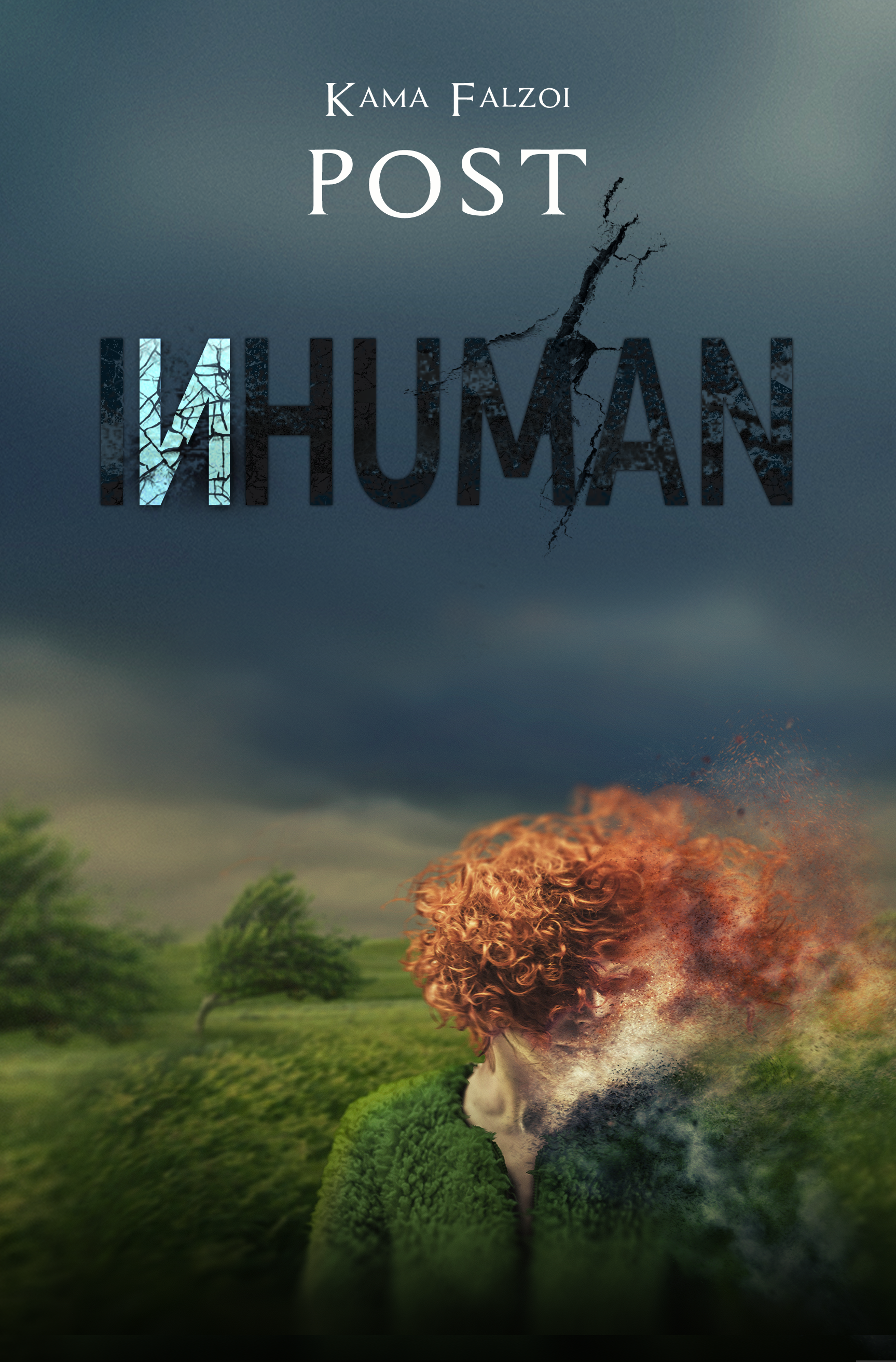
Title: InHuman
Author: Kama Falzoi Post
Genre: Young Adult Sci-Fi
Release Date: December 13, 2016
Publisher: BookFish Books
Cover Artist: Anita Carroll at Race-Point
About InHuman
Mira’s mother sizes up bodies at the morgue like she’s rifling through the sales rack: this one’s too big… this one’s too small… ah, here it is. Just right. The perfect vessel for the one they’ll call Adam.
Since Adam’s survival is the key to drawing out the Conduit—a slippery sort bent on evacuating souls from their human bodies—Mira must help him pass for a typical teenage boy. That means showing him how to talk right, walk right, chew with his mouth open… blend in.
Ironic, because blending in is has always been a challenge for Mira, especially with hair the color of a Dorito. But at their small, secluded prep school, blending in is a matter of life and death.
Because the Conduit is watching.
BUY InHuman Now: https://www.amazon.com/InHuman-Kama-Falzoi-Post-ebook/dp/B01M98ZUXR
Add InHuman to your Goodreads List: https://www.goodreads.com/book/show/30077755-inhuman?from_search=true#other_reviews
About Kama Falzoi Post:
 Kama Falzoi Post is a functioning member of society, a part-time introvert, a pinnacle of contradictions, the mother of a hurricane, a step-mother, and an author. She enjoys drinking red wine and then drinking more red wine, listening to music that moves her, and taking things too far.
She developed a love of books and writing at a very early age. Her stories have appeared in a handful of literary magazines including Inkwell and SmokeLong Quarterly, and most recently in the anthology Outliers of Speculative Fiction. She lives in a small town outside a small city with her husband, son, and too many cats.
Twitter: @KamaPost
Facebook: https://www.facebook.com/KamaFalzoiPost/
Goodreads: https://www.goodreads.com/KamaPost
WordPress: https://kamafalzoipost.wordpress.com
a Rafflecopter giveaway


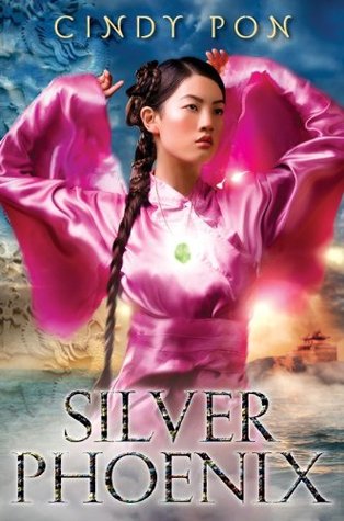 The hardcover of Cindy Pon’s YA fantasy SILVER PHOENIX immediately grabbed my attention the first time I saw it. The colors are bold and gorgeous (something about the combo of the pink and blue hit all the right aesthetics for me), and the yellow/gold color in the background makes it looks like the cover is glowing. I get a strong sense of character from the cover model and hints of the fantasy world I’m about to delve into.
 Another favorite YA fantasy cover is Melina Marchetta’s FROI OF THE EXILES. The colors are subtle, but, again, the use of color to convey light is so effective in catching my eye. The somber expression of the cover model and the sword hilt in layered in front of his face give it a dangerous feel, and the mountains at the bottom provide a sense of mystery. Looking at these two first examples, I’m noticing they both have clouds and a sunset (sunrise?) in them. Not sure what to make of that similarity, but felt worth pointing out.
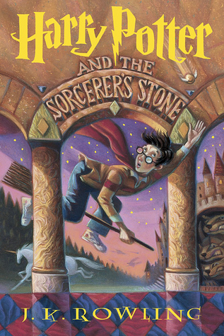 I have the Harry Potter books in the British and U.S. versions, but for me, nothing tops the covers of the U.S. hardcover editions. The illustrations of Mary GrandPré are superb. It’s hard to pick a favorite (maybe Half-Blood Prince), but the first book serves as a beautiful example of a magical middle grade cover. The movement of Harry, the sense of wonder every detail evokes, the magical elements to it, the iconic font of Harry’s name…I could go on, but let’s just say these covers are among my all-time favorites.
 So many of my favorite covers are fantasy ones, but I wanted to include something more contemporary. Nova Ren Suma’s IMAGINARY GIRLS has fantastical elements to it but is also deeply rooted in a more contemporary world. The calmness of the girl underwater creates so much drama and intrigue. Is she drowning? If she is, why is she so calm? And again, it comes back to color. The tranquil blue juxtaposed by the pop of red ribbon, and the utter paleness of the girl. Well, this cover totally made me want to read the book!