Books for kids, teens, & those who are young at heart

Category: Art (Page 4 of 9)

Sign Up for the PIRATE ISLAND Cover Reveal

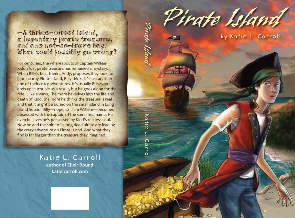
Sign ups are ready for the cover reveal of my middle grade adventure PIRATE ISLAND. It was created by Susan Tait Porcaro and is awesome! I’m so excited about sharing it with the world soon. The big reveal will take place on April 17, 2017, and you can share it on that date or anytime after.

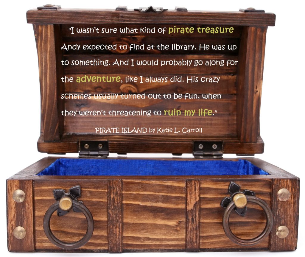
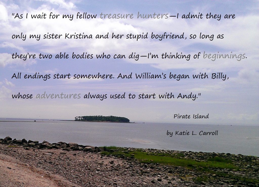
To sign up, simply fill out the PIRATE ISLAND cover reveal form. Thanks so much for helping to spread the word about my latest novel! Here’s a little teaser for you.

Middle Grade Adventure PIRATE ISLAND Is Going To Be A Book!

Last week brought you my big baby news, and as promised, this week I’m bringing you book news. I’ve decided to jump into self-publishing, starting with my middle grade adventure PIRATE ISLAND in the fall. So this year I’ll be bringing a human baby and a book baby into the world!

This is a move I’ve been considering for awhile now, and I’m really excited about the level of control I have over the process. I’m not setting an exact release date yet because I’m working on a bit of a learning curve and doing much of it myself. And with the (human) baby coming in July, I want to make sure I give myself enough time to get everything done right.

I did hire illustrator Susan Tait Porcaro to do an original piece of artwork for the cover. (No way I was tackling that myself!) She’s a fellow contributor to THE GREAT CONNECTICUT CAPER, and her illustration was a household favorite. It’s been very exciting working with her on a concept and seeing a few early sketches.

How can you help, you ask? (And even if you haven’t asked, I’m going to tell you ;).) Well, I’ll be looking for bloggers/readers/writers/anyone to help with the cover reveal in a few months and of course to help spread the word when the book releases. I’m working on getting ARCs (advanced review copies) set up, so I’ll be looking for reviews as well. I’ll be doing a pre-sale for PIRATE ISLAND, so, ya know, you can pre-order the book when that happens. And I’m going to finally put together an author newsletter, so you can subscribe to that soon for my latest book news.

I’ll have a lot more details about PIRATE ISLAND and the self-publishing process in the coming weeks and months. I’ll leave you with a little teaser from the book.

The Highly Charged Political Environment We Are In

I know I’ve been quiet on the blog lately. In part because I’ve been making it a priority to be noisy in real life and the blog has taken a backseat to that. But it’s not just that.

This blog–my Observation Desk–has always served as a safe space for me to share my thoughts. I’ve pointedly strayed away from highly charged political and controversial topics. Not necessarily censoring myself, but being careful in order to keep this a safe space…for myself and for those of you who actively participate here (and I’m incredibly thankful for all of you who take time out of your day to read my posts). It’s always served as one of my favorite creative spaces, and I’ve protected it to keep it positive because that’s what I’ve needed from it. I’ve needed to feel safe here in order to create.

I’ve seen how people (particularly woman and POC) can be harassed and attacked on the Internet for their thoughts and beliefs. In the past, I’ve protected myself and this space from that. I’ve had that privilege when others haven’t. I recognize that.

But right now, in the U.S.’s current political climate, everything has become political. Literature and art have always been political, but now the very places we shop, the causes we choose to support and donate to, whether or not we speak up..it’s all political. This is new to me, though I know this idea of life in general not being political is not new to others.

So I’m confronting my own decision to keep this a “safe” space. I’m confronting and recognizing my own privilege in ways I never have before. I’m listening and learning from people who do not have the luxury of having a privilege like mine, and I’m believing what they say. I’m challenging the lawmakers from my state and beyond to stand up for what is right by making phone calls, writing emails, standing with others, and voicing my beliefs in a way I never have before.

My perspective has shifted so much in the last year. I see the world in a different, often scarier, light than I used to. But this world that feels so new to me is an old world for many who have been fighting oppression and racism for their whole lives. I don’t always know the best way to act or react, and I have to fight my default to stay quiet and think that this isn’t my fight and to wonder what my voice can possibly bring to the table. I’m not always successful in my attempts, but I’m learning and listening, always listening.

I’m not saying any of this because I’m turning this blog into something new or different. Having a creative space and keeping my sanity enough to be able to create stories for kids is important. It’s always been a political act (as I said earlier, I believe all literature is), and the urgency of its importance is even more evident to me now.

The Observation Desk will still be a place to share creative thoughts and works, but I couldn’t ignore this part of me that was staying quiet here (I get a lot more political on Twitter @KatieLCarroll if you’re interested in checking that out). It felt dishonest, like I was keeping a secret, even though I wasn’t necessarily keeping it a secret (if you know me in real life, my political thoughts are certainly not a secret). So I may delve into that part of myself here more often.

With all that is going on in this country and around the world, it’s still going to be a big year for me personally and as an author. I’ll be sharing more about both of those aspects of my life here on this blog. I’ll continue to bring you guest posts, lots more #InkRipples each month, and pictures of the boys. This blog will continue to focus on creativity and books, no doubt about that. But now you know there’s been a lot more on my mind lately, and I’m happy to share that part of me with you (even though it feels like a messy, unfinished part of myself).

So stay tuned to learn more about my creative works-in-progress and the work-in-progress that is Katie as well!
January #InkRipples: The Cover Process for ELIXIR BOUND by Katie L. Carroll

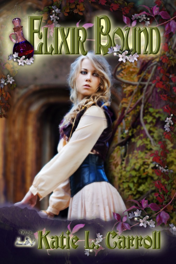
I originally wrote this post back when I did the blog tour for my YA fantasy ELIXIR BOUND. I don’t think I’ve ever posted it on my blog, and I thought it would be fun to highlight the cover process of my book during the January #InkRipples theme of book covers.

I was lucky enough as a MuseItUp author to have a little input (mostly in the form of an author questionnaire) when it came to the cover of ELIXIR BOUND. That’s not to say that I can take any credit for how gorgeous it is. All that credit goes to my cover artist C.K. Volnek.

The beauty of what she did was to take some of my thoughts on what types of covers I like (I happened to cite the American cover for Melina Marchetta’s Froi of the Exiles as one that caught my eye of late) and a few key elements of the story and integrate them into an engrossing and detailed cover that in no way looks crowded or busy. If I knew how she was specifically able to do this, I would probably quit writing and become a cover artist myself (not really, I would never quit writing).

What I can tell you are some of the details I gave her and how they showed up in the cover. (I’ll be honest, this post is really just an excuse to let me point out all the cool things on the cover!) ELIXIR BOUND is essentially about Katora’s quest to retrieve the main ingredient to her family’s secret healing Elixir so she can take over as guardian.

Let’s start with character. Katora is definitely the central element on the cover. I expected to be asked about how she looks, but what I didn’t expect was to be asked about her personality. The three words I chose to describe her: stubborn, confident, independent. I think the model depicting Katora was a great fit. Her expression and body language were just right. So character: check!

Let’s move onto plot. The subject of the quest is the Elixir, which is prominently represented in the left-hand corner near the title. The objective of the quest is to find the Elixir’s main ingredient, which just happens to come from the tiny white flowers vining their way along the edges. So plot: check!

Next let’s discuss setting. Most of the journey takes places in a forest. The background gives you a sense of the rustic setting with the tree to the right and the mysterious doorway-type thing behind Katora (is it a cave, the entrance to a tomb?). I like how it sets a mood, but doesn’t get too specific because when I read, I like to let my own imagination fill in those details. Have you noticed the mountain range at the bottom of the cover? Did you notice its shape? The mountain range is aptly called The Sleeping Giant and I was so thrilled to see it included on the cover. So setting: double check!

And finally, my favorite aspect of the cover…my name, of course! It’s been my dream for so many years to see my name on the cover of a book and I couldn’t be more pleased with the result.

#InkRipples is a monthly meme created by Katie L. Carroll, Mary Waibel, and Kai Strand. We pick a topic (January is all about book covers), drop a ripple in the inkwell (i.e. write about it on our blogs), and see where the conversation goes. We’d love to have you join in the conversation on your own blogs or on your social media page. Full details and each month’s topic can be found on my #InkRipples page.

January #InkRipples: The Allure of a Book Cover

Welcome to #InkRipples 2017! It looks like it’s going to be a big year for #InkRipples with lots of new bloggers joining Kai Strand, Mary Waibel, and me (Katie L. Carroll) in our monthly meme. We’re starting off the year by talking about book covers.

The rise of online shopping and ebooks have changed the way I view a book cover. It’s a much less tactile experience than it used to be. Often my first exposure to a book is a small picture of the cover on a screen. Any kind of texture it might have is not evident, and the small details are hard to discern.

This creates a new challenge for cover designers. How do you simultaneously create a cover that pops on a bookshelf and stands out in a small picture on a screen? Well, I’m no cover designer, so that’s not a question I can answer. I can, however, share some of my favorite book covers and why I like them.

Silver Phoenix (Kingdom of Xia, #1)The hardcover of Cindy Pon’s YA fantasy SILVER PHOENIX immediately grabbed my attention the first time I saw it. The colors are bold and gorgeous (something about the combo of the pink and blue hit all the right aesthetics for me), and the yellow/gold color in the background makes it looks like the cover is glowing. I get a strong sense of character from the cover model and hints of the fantasy world I’m about to delve into.

Froi of the Exiles (Lumatere Chronicles, #2)Another favorite YA fantasy cover is Melina Marchetta’s FROI OF THE EXILES. The colors are subtle, but, again, the use of color to convey light is so effective in catching my eye. The somber expression of the cover model and the sword hilt in layered in front of his face give it a dangerous feel, and the mountains at the bottom provide a sense of mystery. Looking at these two first examples, I’m noticing they both have clouds and a sunset (sunrise?) in them. Not sure what to make of that similarity, but felt worth pointing out.

Harry Potter and the Sorcerer's Stone (Harry Potter, #1)I have the Harry Potter books in the British and U.S. versions, but for me, nothing tops the covers of the U.S. hardcover editions. The illustrations of Mary GrandPré are superb. It’s hard to pick a favorite (maybe Half-Blood Prince), but the first book serves as a beautiful example of a magical middle grade cover. The movement of Harry, the sense of wonder every detail evokes, the magical elements to it, the iconic font of Harry’s name…I could go on, but let’s just say these covers are among my all-time favorites.

Imaginary GirlsSo many of my favorite covers are fantasy ones, but I wanted to include something more contemporary. Nova Ren Suma’s IMAGINARY GIRLS has fantastical elements to it but is also deeply rooted in a more contemporary world. The calmness of the girl underwater creates so much drama and intrigue. Is she drowning? If she is, why is she so calm? And again, it comes back to color. The tranquil blue juxtaposed by the pop of red ribbon, and the utter paleness of the girl. Well, this cover totally made me want to read the book!

What aspects of a book cover grab your attention? What are some of your favorite book covers? Next week, I’ll be posting about how the cover of my YA fantasy ELIXIR BOUND came to be.

#InkRipples is a monthly meme created by Katie L. Carroll, Mary Waibel, and Kai Strand. We pick a topic (January is all about book covers), drop a ripple in the inkwell (i.e. write about it on our blogs), and see where the conversation goes. We’d love to have you join in the conversation on your own blogs or on your social media page. Full details and each month’s topic can be found on my #InkRipples page.

« Older posts Newer posts »

© 2024 Katie L. Carroll

Theme by Anders NorenUp ↑